PALETTES OF PEACE
The Psychology of Warm Tones
Color is light, and our bodies physically react to different wavelengths. Warm earth tones—such as ochre, terracotta, deep espresso, and amber—lower the heart rate and evoke the primitive comfort of sitting by a hearth fire.
By strictly avoiding cold, clinical hues, you curate a home that actively works to dissolve daily stress the moment you cross the threshold.
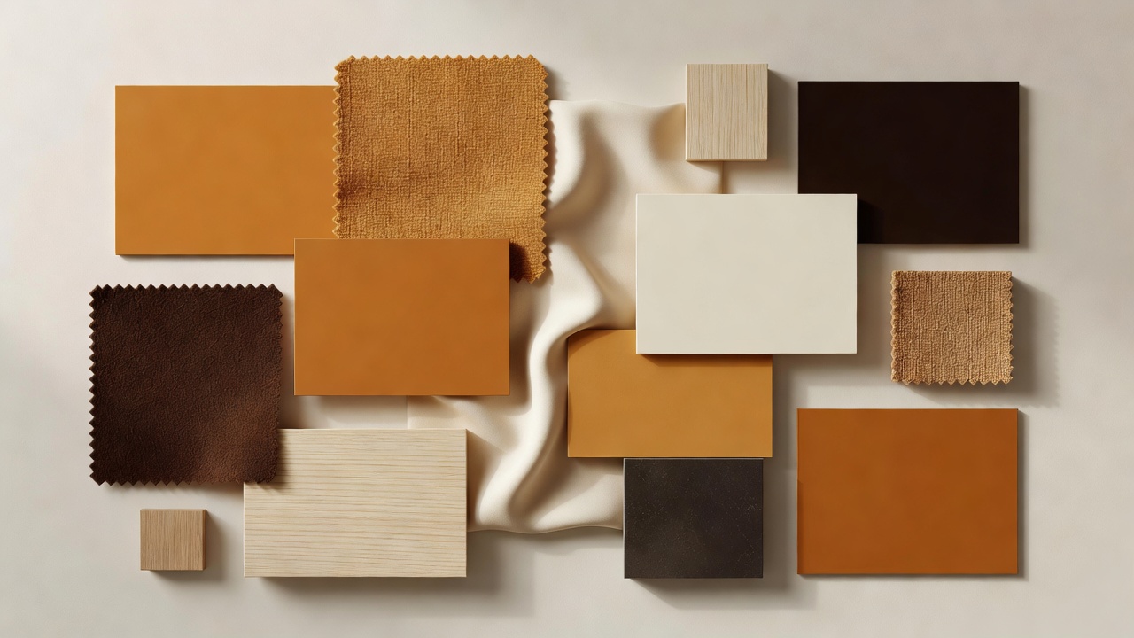
Our Core Cozy Palette
Espresso Base
Dark woods and deep brown paints anchor a room. They create boundary and intimacy, making large, cavernous rooms feel protected and grounded.
Amber Accents
The color of honey and candlelight. Use amber in your textiles, glass lamp shades, and artwork to inject life and warmth without the aggression of stark primary reds.
Warm Cream Canvas
Pure white can feel blinding and clinical. Warm cream, tinged with a hint of yellow or pink, softens the transition between dark base boards and brightly lit windows.